Dashboard
When you first log in (or when no hierarchy item is selected in the sidebar), you see the Dashboard -- a six-card overview of your entire network. The dashboard is the default landing page.
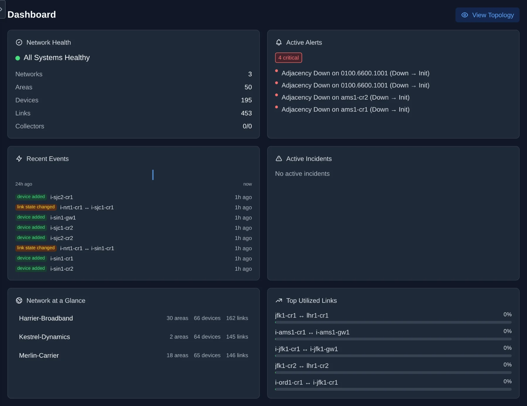
Shows system status and counts of key resources.
-
Status indicator: A colored dot and label showing one of:
- Healthy (green) -- all infrastructure (DB, NATS) is reachable, the engine is running, all enabled collectors are running, and no areas are stale.
- Degraded (yellow) -- infrastructure is up but the engine is unresponsive, some collectors have issues, some SNMP targets are failing, or one or more areas are stale (not receiving updates).
- Unhealthy (red) -- the API, database, or NATS is unreachable.
- Checking (gray, pulsing) -- initial health check in progress.
- Counters: Networks, Areas, Devices, Links, Collectors (running/total), and SNMP Targets (active/total).
Click the status indicator in the bottom bar to open the System Health popover, which shows the status of all 7 services:
| Service | What it checks |
|---|---|
| API Server | Whether the health endpoint itself is reachable |
| Engine | NATS heartbeat (published every 15s) — shows freshness like "Healthy · 12s ago" |
| Collector Manager | NATS heartbeat — shows freshness |
| SNMP Poller | NATS heartbeat — combined with SNMP target count |
| Database | PostgreSQL ping with latency |
| Message Bus | NATS connection status |
| Live Updates | WebSocket connection to the API |
Heartbeat-based services (Engine, Collector Manager, SNMP Poller) show three states:
- Healthy (green) -- last heartbeat received within 45 seconds
- No heartbeat (yellow, pulsing) -- last heartbeat 45–120 seconds ago
- Down / Not responding (red, pulsing) -- no heartbeat received for over 120 seconds, or never seen
Displays severity badges (critical, warning, info) and lists the top 5 firing alerts with colored severity dots. If there are no active alerts, the card shows "No active alerts."
A 24-bar sparkline histogram shows event frequency over the last 24 hours (one bar per hour). Below it, the 8 most recent topology events are listed with color-coded type badges (green for additions, red for removals, amber for changes) and relative timestamps (e.g., "5m ago", "2h ago").
Shows the total correlated incident count with severity badges and summaries of the top 3 active incidents. Each incident displays its event count and time since last event. Incidents group related events (e.g., multiple link failures caused by a single device going down).
A clickable list of all networks with per-network statistics (areas, devices, links). Clicking a network loads its full topology on the canvas and opens the sidebar for navigation.
Tip: This is the fastest way to jump into a specific network's topology from the dashboard.
Lists the 5 most utilized links across all networks with color-coded utilization bars:
- Green: below 80%
- Yellow: 80% to 94%
- Red: 95% and above
Parallel links between the same device pair are deduplicated (only the highest-utilized link is shown). This card requires SNMP traffic monitoring to be configured (see SNMP Traffic Monitoring). If no utilization data is available, the card shows "No utilization data."
The dashboard auto-refreshes every 30 seconds.