A highly customizable Flutter selector library. Supports SelectorBox, DropdownSelectorBar, DropdownSelectorButton, dialog, and bottom-sheet selectors.
Two layers work together: entry points decide where the selector appears, and delegates decide how entries are laid out — any delegate plugs into any entry point.
- Entry points — five ways to show a selector:
SelectorBox(inline),DropdownSelectorBar(tab bar),DropdownSelectorButton(single trigger),showSelector(dialog),showModalBottomSelector(bottom sheet). - Delegates — four layouts:
CascadingSelectorDelegate(tree),GridSelectorDelegate(grid),ListSelectorDelegate(single column),FlattenSelectorDelegate(grid that keeps category grouping). - Single & multiple selection via
SelectionMode(per category or as a delegate fallback). - Async data loading through
entriesLoader. - Flexible entries: the "Any" entry clears a category,
SelectorRangeEntry.customtakes user min/max input, and animmediateentry applies on tap without the action bar. skeletonBuilder&errorBuilderfor loading and error states.- Theming via
SelectorThemeDataand theDropdownSelectorBarTheme/DropdownSelectorButtonThemeextensions. - Built-in i18n in 10 languages via
CriteriaSelectorLocalizationsDelegate.
flutter pub add criteria_selectorimport 'package:criteria_selector/criteria_selector.dart';A delegate controls both data loading and how the body is rendered, and any delegate works with every entry point above.
Entries form a tree. SelectorCategoryEntry is the root (a category) and SelectorChildEntry is any non-root node, identified by its parentId.
| Entry | Purpose |
|---|---|
SelectorCategoryEntry |
Root node. Holds children and the selectionMode for them. |
SelectorTextEntry |
A plain text leaf. Use .any(...) for the "Any" (clear) entry. .name(...) creates a parentless leaf for flat lists. |
SelectorRangeEntry<N, E> |
A numeric range leaf (min/max). Use .any(...) for "Any" and .custom(...) for a user-input range. SelectorIntEntry<E> is a handy alias for SelectorRangeEntry<int, E>. |
Selection is controlled by SelectionMode (single by default, or multiple), set on a SelectorCategoryEntry (per category) or on the delegate (fallback). In multiple-selection mode, an entry with immediate: true applies on tap and skips the action bar.
Entries load asynchronously via entriesLoader, which returns a Future<SelectorEntries> where SelectorEntries is Set<SelectorEntry>.
// A category with single-selection children
SelectorCategoryEntry(
  id: 'price',
  name: 'Price',
  children: {
    SelectorRangeEntry<int, void>.any(parentId: 'price', name: 'Any'),
    SelectorRangeEntry<int, void>(parentId: 'price', id: '0-100', name: '0-100', min: 0, max: 100),
    SelectorRangeEntry<int, void>.custom(parentId: 'price', name: 'Custom'),
  },
);

// A multi-selection category
SelectorCategoryEntry(
  id: 'more',
  name: 'More',
  selectionMode: SelectionMode.multiple,
  children: {
    SelectorTextEntry.any(parentId: 'more', name: 'Any'),
    SelectorTextEntry(parentId: 'more', id: 'near_subway', name: 'Near subway'),
  },
);

// Parentless leaves for a flat list
SelectorTextEntry.name(id: 'default', name: 'Default');
The built-in delegates are:
| Delegate | Description | Preview |
|---|---|---|
CascadingSelectorDelegate |
A tree selector: categories on the left, a cascading list on the right. | 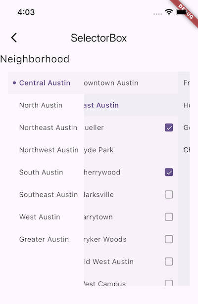 |
GridSelectorDelegate |
A grid layout. crossAxisCount is required. |
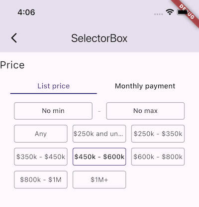 |
ListSelectorDelegate |
A single-column list (use .name(...) leaves for a flat list). |
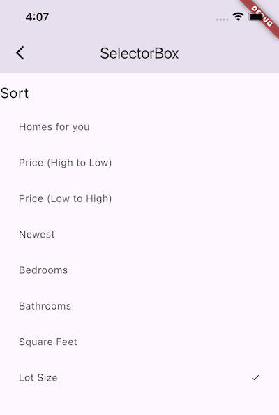 |
FlattenSelectorDelegate |
Renders children in a grid while keeping the category hierarchy. Best with SelectionMode.multiple and an "Any" entry. |
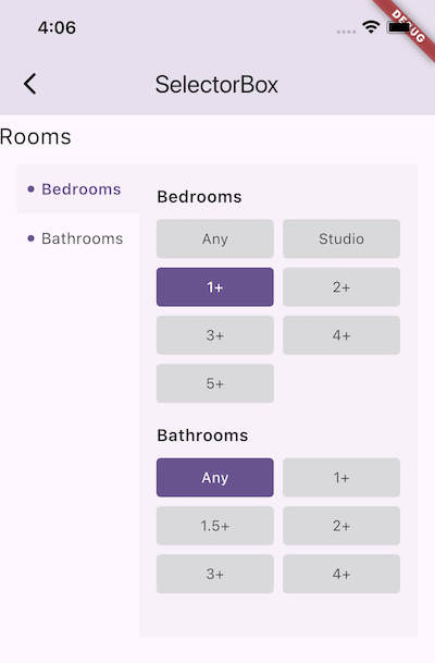 |
SelectorBox embeds a selector directly in a page or dialog body. Pass any delegate from the Delegates section above — it controls both loading and rendering.
SelectorBox(
  delegate: CascadingSelectorDelegate(entriesLoader: _fetchNeighborhood),
  onChanged: (selected) {
    // selected is the SelectorEntries when the selection changes
  },
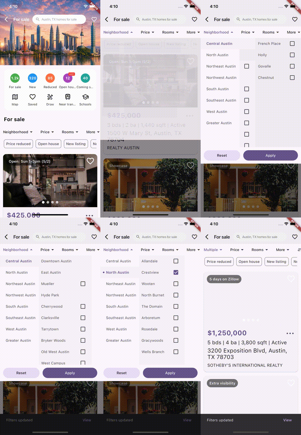
);A tab bar (PreferredSizeWidget) that opens an overlay selector when a tab is tapped. Provide tabs for the bar and a matching selectorDelegates list (one per tab). Results arrive via onChanged / onApplied / onReset.
DropdownSelectorBar(
  tabs: const [
    DropdownTab(label: 'Neighborhood'),
    DropdownTab(label: 'Price'),
    DropdownTab(label: 'Rooms'),
    DropdownTab(label: 'More'),
    DropdownTab(label: 'Sort'),
  ],
  selectorDelegates: [
    CascadingSelectorDelegate(entriesLoader: _fetchNeighborhood),
    GridSelectorDelegate(crossAxisCount: 3, entriesLoader: _fetchPrice),
    GridSelectorDelegate(crossAxisCount: 3, entriesLoader: _fetchRooms),
    FlattenSelectorDelegate(crossAxisCount: 3, entriesLoader: _fetchMore),
    ListSelectorDelegate(entriesLoader: _fetchSort),
  ],
  onApplied: (result) {
    // result is a DropdownSelectorResult; result.selected is the SelectorEntries
  },
);
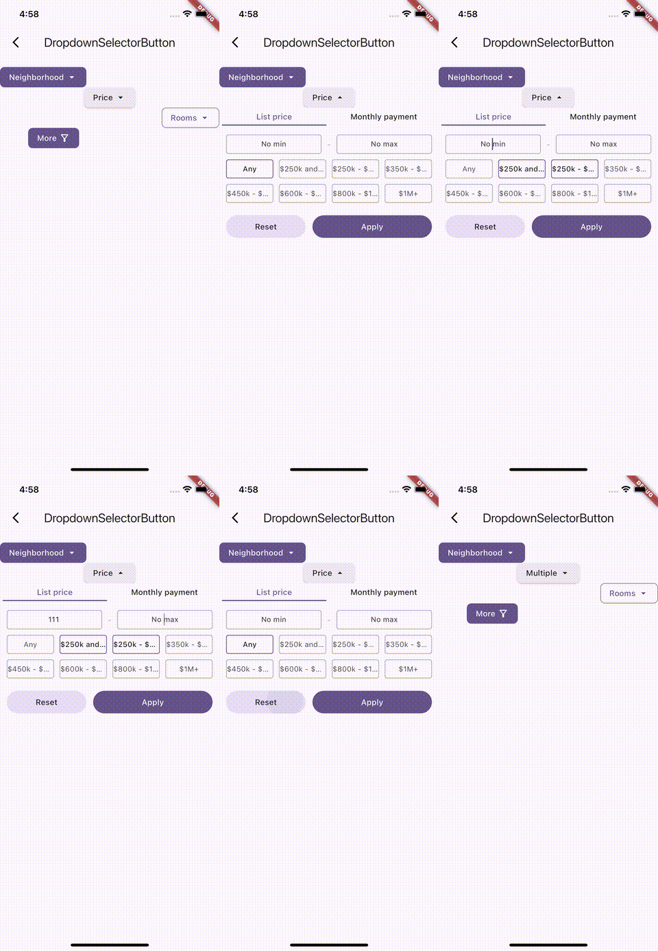
A single-trigger alternative to DropdownSelectorBar — opens a selector overlay on tap, like PopupMenuButton. It takes one selectorDelegate and a label/child. Three variants: filled (default), .elevated(...), and .outlined(...).
DropdownSelectorButton(
  label: 'Neighborhood',
  selectorDelegate: GridSelectorDelegate(crossAxisCount: 3, entriesLoader: _fetchNeighborhood),
  onApplied: (result) { /* ... */ },
);

DropdownSelectorButton.elevated(
  label: 'Price',
  selectorDelegate: GridSelectorDelegate(crossAxisCount: 3, entriesLoader: _fetchPrice),
);

DropdownSelectorButton.outlined(
  label: 'Rooms',
  icon: const Icon(Icons.filter_alt_outlined),
  selectorDelegate: GridSelectorDelegate(crossAxisCount: 3, entriesLoader: _fetchRooms),
);
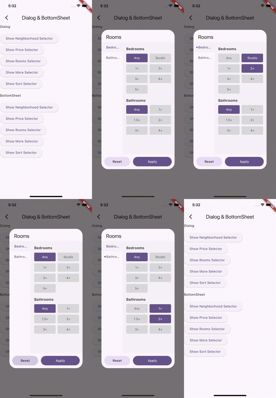
Shows a selector in a modal dialog. Returns the selected SelectorEntries when applied, or null when dismissed. In single-selection mode, tapping an item applies immediately; in multi-selection mode, "Apply" in the action bar confirms.
final SelectorEntries? selected = await showSelector(
  context: context,
  delegate: FlattenSelectorDelegate(entriesLoader: _fetchRooms),
  title: const Text('Rooms'),
);

if (selected != null) {
  // a selection was applied
}
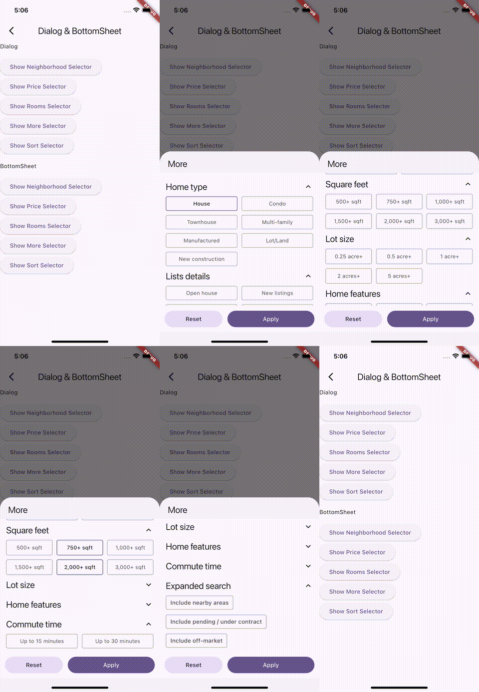
Shows a selector in a modal bottom sheet built on Flutter's showModalBottomSheet. Same interaction as showSelector. Standard sheet parameters (isScrollControlled, isDismissible, enableDrag, showDragHandle, constraints, etc.) are forwarded.
final SelectorEntries? selected = await showModalBottomSelector(
  context: context,
  delegate: ListSelectorDelegate(
    crossAxisCount: 3,
    selectionMode: SelectionMode.multiple,
    entriesLoader: _fetchMore,
  ),
  title: const Text('More'),
);

if (selected != null) {
  // a selection was applied
}
Per instance — pass selectorTheme to any selector entry point (SelectorBox, showSelector, showModalBottomSelector, DropdownSelectorBar, DropdownSelectorButton):
SelectorBox(
  delegate: ListSelectorDelegate(entriesLoader: _fetchSort),
  selectorTheme: SelectorThemeData(
    Theme.of(context),
    selectedColor: Theme.of(context).colorScheme.primary,
    onSelectedColor: Theme.of(context).colorScheme.onPrimary,
  ),
);
Globally — register DropdownSelectorBarTheme and DropdownSelectorButtonTheme as ThemeData extensions so every bar/button picks them up automatically:
MaterialApp(
  theme: ThemeData(
    extensions: [
      DropdownSelectorBarTheme(
        height: 48,
        labelColor: Colors.blue,
        selectorTheme: SelectorThemeData(ThemeData.light()),
      ),
      DropdownSelectorButtonTheme(
        backgroundColor: Colors.green,
        foregroundColor: Colors.white,
      ),
    ],
  ),
);Add CriteriaSelectorLocalizationsDelegate() to your MaterialApp. It ships translations for en, zh (Hans/Hant), es, pt, id, vi, fr, de, ja, and ko, localizing the "Apply" / "Reset" / "Multiple" labels automatically.
const localizationsDelegates = <LocalizationsDelegate>[
  GlobalMaterialLocalizations.delegate,
  GlobalWidgetsLocalizations.delegate,
  CriteriaSelectorLocalizationsDelegate(),
];

const supportedLocales = CriteriaSelectorLocalizationsDelegate.supportedLocales;

MaterialApp(
  localizationsDelegates: localizationsDelegates,
  supportedLocales: supportedLocales,
  home: const HomePage(),
);
To override the labels for a single delegate, set applyText / resetText on it directly.