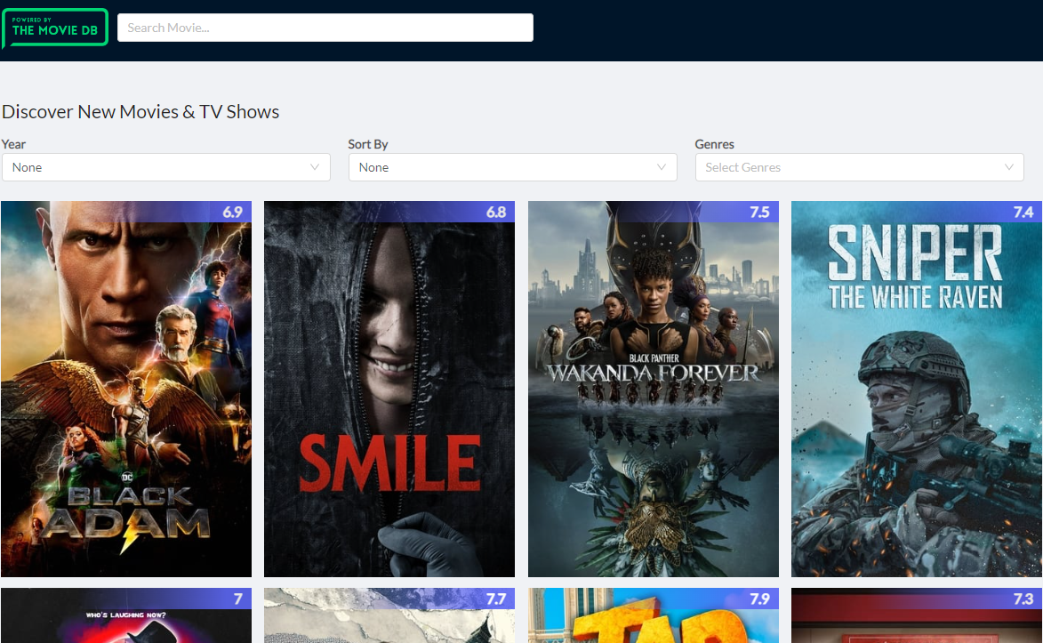
The React-movie-explorer project is a user-friendly platform that simplifies movie discovery and exploration. With features like real-time search, dynamic genre lists, and interactive movie details, it caters to movie enthusiasts looking for a seamless browsing experience. By offering a visually appealing interface and comprehensive movie information, it enhances user engagement and enjoyment.
|
Feature |
Summary |
| ⚙️ |
Architecture |
- Utilizes React for building a dynamic and interactive user interface.
- Integrates React Router for managing navigation and routing within the application.
- Employs Axios for handling API requests and data retrieval.
|
| 🔩 |
Code Quality |
- Follows ESLint and Prettier standards for consistent code formatting.
- Utilizes PropTypes for type-checking component props.
|
| 📄 |
Documentation |
- Extensive inline comments in JavaScript files for code clarity and understanding.
- Includes a detailed README.md file with installation, usage, and testing instructions.
- Utilizes JSDoc comments for documenting functions and components.
|
| 🔌 |
Integrations |
- Integrates Ant Design for UI components and styling.
- Utilizes React Player for video playback functionality.
- Includes ScrollReveal for scroll animations and effects.
|
| 🧩 |
Modularity |
- Organizes components into separate folders for reusability and maintainability.
- Utilizes Utils folder for common utility functions across the application.
- Follows a component-based architecture for easy component isolation and management.
|
| ⚡️ |
Performance |
- Optimizes image loading with lazy loading and image size optimization.
- Utilizes pagination for large data sets to improve loading times.
- Implements service worker for offline capabilities and faster subsequent visits.
|
| 🛡️ |
Security |
- Secures API requests by appending API key to every request header.
- Implements error handling for invalid requests and responses.
- Ensures data sanitization to prevent XSS attacks.
|
| 📦 |
Dependencies |
- Manages dependencies using npm with a detailed package-lock.json file.
- Includes key dependencies like Ant Design, Axios, and React Router Dom for core functionality.
- Utilizes gh-pages for project deployment to GitHub Pages.
|
└── React-movie-explorer/
    ├── README.md
    ├── movies.png
    ├── netlify.toml
    ├── package-lock.json
    ├── package.json
    ├── pnpm-debug.log
    ├── public
    │   ├── favicon.ico
    │   ├── images
    │   │   ├── logo.png
    │   │   ├── no_logo.jpg
    │   │   ├── no_photo.jpg
    │   │   └── no_poster.png
    │   ├── index.html
    │   └── manifest.json
    ├── shrinkwrap.yaml
    └── src
        ├── API
        │   ├── MoviesAPI.js
        │   └── PeopleAPI.js
        ├── App.css
        ├── App.js
        ├── App.test.js
        ├── components
        │   ├── ActorProfile
        │   │   └── ActorProfile.js
        │   ├── Alert
        │   │   └── Alert.js
        │   ├── Card
        │   │   ├── Card.css
        │   │   └── Card.js
        │   ├── Cast
        │   │   ├── Cast.css
        │   │   └── Cast.js
        │   ├── Discover
        │   │   └── Discover.js
        │   ├── Gallery
        │   │   └── Gallery.js
        │   ├── Genre
        │   │   └── Genre.js
        │   ├── ListGenres
        │   │   └── ListGenres.js
        │   ├── ListMovies
        │   │   ├── ListMovies.css
        │   │   └── ListMovies.js
        │   ├── Menu
        │   │   ├── Menu.css
        │   │   └── Menu.js
        │   ├── MovieDetails
        │   │   ├── MovieDetails.css
        │   │   └── MovieDetails.js
        │   ├── MovieMeta
        │   │   ├── MovieMeta.css
        │   │   └── MovieMeta.js
        │   ├── ProdCompanies
        │   │   └── ProdCompanies.js
        │   ├── ProfileDetails
        │   │   ├── ProfileDetails.css
        │   │   └── ProfileDetails.js
        │   ├── Reviews
        │   │   └── Reviews.js
        │   ├── ScrollToTop
        │   │   └── ScrollToTop.js
        │   ├── SearchMovies
        │   │   ├── SearchMovies.css
        │   │   └── SearchMovies.js
        │   ├── Similar
        │   │   └── Similar.js
        │   ├── Utils
        │   │   ├── Utils.js
        │   │   └── stringCase.js
        │   └── Videos
        │       ├── Videos.css
        │       └── Videos.js
        ├── config
        │   ├── axios.js
        │   └── config.js
        ├── index.css
        ├── index.js
        ├── logo.svg
        └── serviceWorker.js
REACT-MOVIE-EXPLORER/
__root__
| package-lock.json |
- The `package-lock.json` file in the project structure defines dependencies for the "movies" project
- It ensures that the necessary packages like "@ant-design/icons", "antd", "axios", "lodash", and others are locked at specific versions to maintain consistency and stability within the codebase architecture
- This file plays a crucial role in managing the project's dependencies and ensuring smooth integration of external libraries. |
| netlify.toml |
Redirects all incoming requests to the root URL with a 200 status code, ensuring a seamless user experience. |
| shrinkwrap.yaml |
- The `shrinkwrap.yaml` file in the project structure defines the dependencies and packages required for the codebase architecture
- It specifies key dependencies such as antd, axios, lodash, and react-router-dom, along with package details like versions and dependencies for specific modules
- This file plays a crucial role in managing and ensuring the stability of the project's dependencies. |
| package.json |
- Manages dependencies and scripts for the React movie explorer project
- Handles package versions, build, testing, deployment, and development tools configuration
- Supports project deployment to GitHub Pages. |
src
| index.css |
- Define global typography styles for the project, ensuring consistent font rendering across all elements
- Set base styles for body and code elements to enhance readability and maintain a cohesive design language throughout the application. |
| App.css |
- Define the global styling for the project's UI components, ensuring consistency and a cohesive look and feel across the application
- The CSS file establishes typography, layout structure, alignment, and responsiveness for various screen sizes, enhancing user experience and visual appeal. |
| App.test.js |
- Verifies that the App component renders without issues by creating a temporary div element, rendering the App component within it, and then unmounting the component
- This test ensures the stability of the App component's rendering functionality within the project architecture. |
| serviceWorker.js |
- Enables service worker registration for offline capabilities and faster subsequent visits in production
- Handles updating cached resources in the background and provides callbacks for update and success events
- Supports localhost checks and service worker validation
- Allows for service worker unregistration. |
| App.js |
- Manages the layout and routing for the React Movies App, displaying different components based on the URL path
- Integrates navigation, movie details, genres, and actor profiles seamlessly within the app's structure. |
| index.js |
Renders the main application component using React and initializes service worker registration for offline functionality. |
config
| axios.js |
- Enhances Axios requests by appending a config key to every request header
- This code file in src/config/axios.js plays a crucial role in the project architecture by ensuring that the API key is included in all outgoing requests
- This helps maintain consistency and security across API interactions. |
| config.js |
- Defines constants for API configuration, filters, pagination, colors, routes, image URLs, and error messages used throughout the project
- This file centralizes key values and settings, ensuring consistency and easy maintenance across the codebase. |
components
Utils
| Utils.js |
- Implements utility functions for string manipulation, URL extraction, and age calculation
- Handles tasks like converting strings to URL-friendly formats, capitalizing text, and extracting information from URLs
- Additionally, provides a function to remove background images
- These utilities enhance the codebase's functionality by simplifying common operations across components. |
| stringCase.js |
- Enhances string formatting by converting text to title case, handling small words, intentional capitalization, and URLs
- This class extends the String object to provide a method for transforming strings into a more visually appealing title case format. |
Card
| Card.css |
- Define styles for interactive movie cards with hover effects, overlay transitions, and content details
- Ensure responsive design for various screen sizes, optimizing user experience. |
| Card.js |
- Generates a movie card component displaying movie details and allowing users to click for more information
- Handles rendering of movie title, poster, rating, and overview with interactive elements
- Navigates to a detailed movie page upon user click, enhancing user experience within the application. |
Genre
| Genre.js |
- Generates dynamic genre-specific movie lists with infinite scrolling capability based on user interaction
- Utilizes React components to display movies categorized by genre, enhancing user experience through continuous content loading. |
SearchMovies
| SearchMovies.js |
- Enables users to search for movies with real-time suggestions and detailed information
- Handles user input, fetches movie data, and displays results elegantly
- Facilitates seamless navigation to selected movie details
- Enhances user experience by providing a dynamic and interactive movie search feature within the application. |
| SearchMovies.css |
- Define styling rules for movie search items and dropdown menu items, ensuring proper alignment and readability
- Adjust font sizes and spacing for different screen sizes, enhancing user experience. |
ScrollToTop
| ScrollToTop.js |
Enables smooth scrolling to the top of the page when navigating between routes in a React application. |
ListGenres
| ListGenres.js |
- Generates and displays movie genres as clickable tags with random dark colors
- Links to genre-specific pages using React Router
- Utilizes configuration data for colors and routes. |
ProdCompanies
| ProdCompanies.js |
- Render a component displaying production companies' logos with tooltips, linking to their details
- Handles displaying up to 8 companies per page, optimizing performance. |
Gallery
| Gallery.js |
- Render a responsive image gallery component that displays a list of images with lightbox functionality
- The component dynamically paginates images and handles empty states gracefully
- Utilizes configuration settings for image sizes and error messages. |
ProfileDetails
| ProfileDetails.css |
- Define the styling for the profile details component, including the profile picture, metadata, and actor details
- Ensure proper layout and design for a visually appealing user interface
- Implement responsive design adjustments for optimal display on various screen sizes. |
| ProfileDetails.js |
- Display detailed profile information and media content for a selected profile
- Includes basic details like name, gender, age, and biography, along with tabs for photos, cast, and crew information
- Utilizes lazy loading for improved performance
- Allows users to navigate through media content with pagination. |
ListMovies
| ListMovies.js |
- ListMovies component dynamically fetches and displays movies based on different criteria like trending, genre, or discovery
- It efficiently manages state updates and renders movie cards with smooth animations
- The component handles loading states and error messages gracefully, enhancing the user experience within the application. |
| ListMovies.css |
Define styling rules for movie cards, loading spinner, and responsive design in the ListMovies component. |
Menu
| Menu.css |
- Define the styling for the menu header, logo, and responsive behavior in the project's CSS file located at src/components/Menu/Menu.css
- This file ensures the menu header remains fixed at the top, sets the logo size and padding, and adjusts menu item styling for optimal display. |
| Menu.js |
- Defines the header menu component responsible for rendering the logo and search functionality in the project's user interface
- The component encapsulates the layout and navigation elements, enhancing the overall user experience by providing easy access to key features. |
Cast
| Cast.css |
Define styling for the Cast component to ensure proper alignment and responsiveness on different screen sizes within the project architecture. |
| Cast.js |
- Generates a dynamic cast display for movies, showcasing actors with their characters
- Utilizes React components and Ant Design for UI elements
- Handles image loading and navigation to individual actor pages
- Implements pagination for limited cast results. |
Videos
| Videos.css |
Define responsive video styling for the project, ensuring videos adapt well to various screen sizes. |
| Videos.js |
- Render a dynamic video gallery component with modal playback functionality
- Display videos in a lightbox format with thumbnails, allowing users to play videos on click
- Utilize React hooks for state management and integrate with YouTube API for video playback
- Implement pagination for video list if provided. |
Reviews
| Reviews.js |
- Render a list of reviews with the option to expand for more content if available, utilizing the Ant Design library
- If reviews exist, display each review with the author's name, avatar, and content
- If no reviews are present, show an empty state message
- The component fetches configuration data from an external file for consistency. |
Alert
| Alert.js |
- Generates an alert component for displaying messages with specified title, message, and type
- The component utilizes the Ant Design library to render an alert box with an optional icon
- The main content is wrapped within a div element for styling purposes. |
ActorProfile
| ActorProfile.js |
- Displays actor profile details, including breadcrumb navigation and error handling
- Fetches actor data from the API based on the provided ID
- Handles loading state and redirects to the home page if ID is missing
- Renders profile information and movie details if available, else shows an error message. |
MovieDetails
| MovieDetails.js |
- Manages movie details display, including info, cast, images, videos, reviews, and similar movies
- Handles loading states, error messages, and navigation
- Utilizes lazy loading for improved performance
- Integrates with external APIs for movie data retrieval
- Enhances user experience with dynamic content pagination. |
| MovieDetails.css |
- Define the styling for movie details, including layout, typography, and image display
- Ensure a consistent and visually appealing presentation of movie information, cast details, and production companies
- Implement responsive design for optimal viewing on various devices, adjusting layout and font sizes accordingly. |
Discover
| Discover.js |
- Enables users to discover new movies and TV shows by selecting filters such as year, sorting criteria, and genres
- The component dynamically updates results based on user selections, providing an interactive and personalized browsing experience
- This functionality enhances user engagement and facilitates exploration of diverse content offerings within the platform. |
MovieMeta
| MovieMeta.css |
Define styling for movie metadata components based on screen size and font styles to ensure consistent and visually appealing presentation across devices. |
| MovieMeta.js |
- Generates movie metadata display for React components, showcasing release date, runtime, budget, revenue, vote average, and spoken languages
- Utilizes CountUp for numerical animations and Flip for visual effects
- Organizes data in rows and columns for a clean presentation. |
Similar
| Similar.js |
Render a list of similar movies using React components, enhancing user experience by displaying movie cards in a visually appealing manner. |
API
| MoviesAPI.js |
- Handles API requests for movie data including discovering movies, fetching popular movies, searching movies, retrieving movie details, and filtering movies by genre
- The file interacts with the Axios configuration to make HTTP requests to the movie API endpoints based on specified filters and parameters. |
| PeopleAPI.js |
- Retrieve basic profile details for people from the API by making a request to the specified endpoint
- If successful, return the response data; otherwise, throw an error indicating that the profile was not found. |
public
| index.html |
- Defines the structure and content of the main HTML file for the Movies Explorer React App
- Sets up metadata, links to external resources, and defines Open Graph and Twitter card properties for social sharing
- Displays a message for users without JavaScript enabled and renders the root element for the React app. |
| manifest.json |
- Defines the manifest.json file for the React App, specifying essential details like the app's name, icons, start URL, display mode, theme color, and background color
- This file plays a crucial role in configuring the app's appearance and behavior when added to the project structure. |
Before getting started with React-movie-explorer, ensure your runtime environment meets the following requirements:
- Programming Language: JavaScript
- Package Manager: Npm
Install React-movie-explorer using one of the following methods:
Build from source:
- Clone the React-movie-explorer repository:
❯ git clone https://github.com/amitpatil321/React-movie-explorer
- Navigate to the project directory:
❯ cd React-movie-explorer
- Install the project dependencies:
Using npm 
Run React-movie-explorer using the following command:
Using npm
Run the test suite using the following command:
Using npm
Contributing Guidelines
- Fork the Repository: Start by forking the project repository to your github account.
- Clone Locally: Clone the forked repository to your local machine using a git client.
git clone https://github.com/amitpatil321/React-movie-explorer
- Create a New Branch: Always work on a new branch, giving it a descriptive name.
git checkout -b new-feature-x
- Make Your Changes: Develop and test your changes locally.
- Commit Your Changes: Commit with a clear message describing your updates.
git commit -m 'Implemented new feature x.'
- Push to github: Push the changes to your forked repository.
git push origin new-feature-x
- Submit a Pull Request: Create a PR against the original project repository. Clearly describe the changes and their motivations.
- Review: Once your PR is reviewed and approved, it will be merged into the main branch. Congratulations on your contribution!
Contributor Graph


